12 Days of Monsters: Day 10
12 Days of Monsters is a series exploring the visual design of different monsters - looking at what makes them successful (or not), what trends they represent, and what they mean to me personally.
The Monster
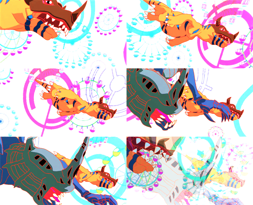
Diaboromon
from the 2000 film DIGIMON ADVENTURE: OUR WAR GAME!
This one's gonna be both tough and fun. I've wanted to write about this one for a while now, but struggled with how to approach it.
See, I fell in love with with this monster when I was a kid, which means there's an extent to which I'll always love it - and an extent to which I won't be able to effectively convey why.
So I'm going to try to do that here through stories: by talking through when I fell in love with this monster, and by exploring the features that stick out in my memory most strongly.
Part One
Mystery, the Internet, and fandom
I was an intense kid. When I became a fan, I went hard - I would hunt down everything I could about the object of my interest. (This was at least a decade before I would first hear the term "hyperfixation" from a clinician.)
One of my early fandoms, for instance, was the Mortal Kombat games - of which my favorite character was the yellow ninja named Scorpion.
I didn't just join the official Mortal Kombat fan club. I bought strategy guides for Mortal Kombat games I didn't have, so I could see and read more about the characters I loved (this was pre-internet). I became fascinated with real life scorpions, and bought specimens preserved in glass. I considered 19 to be my lucky number, because "S" was the 19th letter of the alphabet. I looked up the name of the martial artist who played Scorpion in the 1995 film MORTAL KOMBAT and bought an action figure of him. To be clear: not an action figure of Scorpion, an action figure of the guy who played him in a movie, once. (Chris Casamassa, by the way.)
An eBay listing for the Chris Casamassa action figure I used to have. You can’t even read it here, but right above “RED DRAGON”, it says “Chris Casamassa”.
See, look - you can read it better on the back of the box - this definitely says “Chris Casamassa”. I have no idea how I found this as a kid.
I'd have several other fan-obsessions around that age - including the 1996 anime NEON GENESIS EVANGELION (introduced to me by a friend's older sister) and the 1999 anime DIGIMON ADVENTURE (introduced to me by TV).
By the time Digimon rolled into my life, the internet was certainly A Thing, and it took my fan obsession to a new level. (I ended up creating and running a Digimon fansite for a couple years, to give you an idea.) But Digimon was a different thing to be a fan of than, say, Mortal Kombat - because it wasn’t from America. Despite the (in retrospect terrible) dubbing from the American airing of DIGIMON ADVENTURE, the characters and creatures still had a clearly foreign sensibility compared to other cartoons I'd grown up with (like BATMAN: THE ANIMATED SERIES). This made it less familiar, and therefore much more fascinating, to my juvenile eyes.
And unlike EVANGELION, Digimon wasn't over. There was way more Digimon in Japan than what I had seen so far, and more coming. Combine that with my newfound internet addiction, and baby, we had a stew going: A fandom for which you could see into the future, barely, but it was slightly obscured in a frustrating a delightful way (i.e. the sites were a language which I did not speak).
This was before there were many substantial communities to bridge the language gap, and certainly before widespread resources like Google Translate. Gathering information about Digimon content that hadn't made it to America yet felt like some kind of digital augury. Sometimes, it was looking at scans of foreign-language trading cards that had pictures of creatures that looked slightly like characters I had seen, and trying to figure out what they meant. Other times, it meant spending hours diving through webrings of Japanese sites and trying to guess if the images I found were screenshots of real movies/episodes that didn't come to America yet, or just very talented fan art.
It was a wild, interpretative, almost free-associative type of “research”. At times, it was impossible for me to separate “canon” from my own speculation.
One of the things I turned up was this really cool-looking villain in some piece of upcoming Digimon media, called Diaboromon. The few images I found of it looked awesome, and either checked boxes I already had or created entirely new boxes in me to check - I thought it looked like the coolest thing ever, and became hooked on this enigma that I barely knew anything about.
And then, after a few months that felt like years to me, I got to see it: The original Japanese film OUR WAR GAME! got re-dubbed, re-cut, and mixed into an American theatrical release called DIGIMON: THE MOVIE - and I got to meet the villain of my dreams.
Diaboromon was everything I’d hoped for and more, even though his screentime totaled less than a few minutes.
Part Two
Creepy Puppets
What did I find so striking about Diaboromon as a kid?
Part of it was the aesthetics of the movie in which it appeared. OUR WAR GAME! had a more "anime" style than DIGIMON ADVENTURE, which made it stand out from the other cartoons I was watching even more. It was thrillingly bright and kinetic, full of super-saturated colors bounded by bright outlines, and with animation much more fluid than most of what I saw on TV.
But part of it was this sense of "otherness" that seemed to permeate everything about Diaboromon. Some of this was also reflected in his visual design - like his unmoving face, with its permanent gape and lidless eyeballs, like a polygonal Hannya mask.
Diaboromon’s face barely moves in the movie
Diaboromon also didn't move the way things moved in other media I was used to. It flung itself around like a puppet being swung through the air. It was both bulky and lanky. When it moved, it was simultaneously limp and powerful.
A shot of Diaboromon leaping backwards, his limbs appearing to stream away from him as he flies through the space.
(I couldn’t find any clear images of this moment, so this is a screenshot of a YouTube video of a VHS release of the American re-cut, to show you how surprisingly hard it is to unearth some media from the early-2000s.)
Its anatomy seemed to follow a logic (and physics) that set it apart from nearly everything I watched...
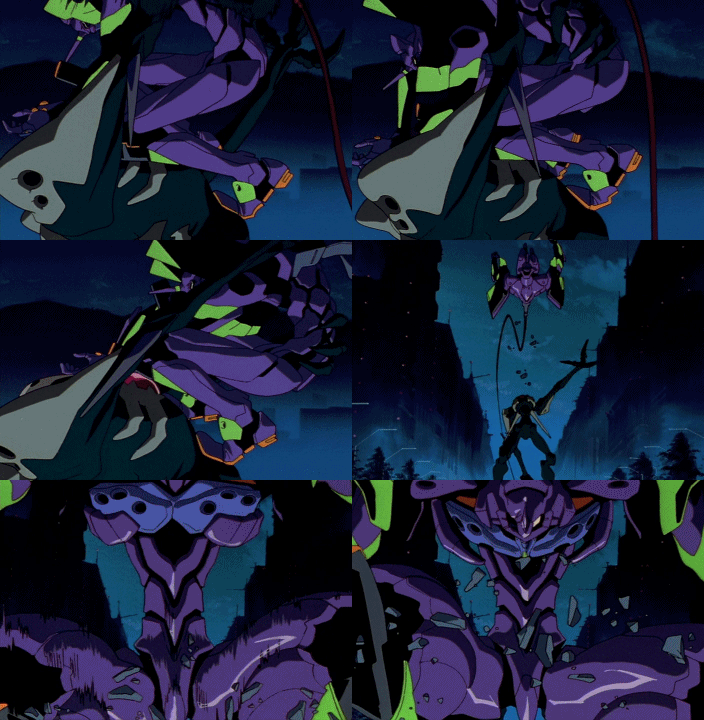
...except for Evangelion. In fact, specifically, one scene from Evangelion: where Eva Unit 01 is fighting Sachiel. Even more specifically, one moment from that scene.
The still-standing Sachiel throws Eva 01 off its chest.
From the original 1996 anime NEON GENESIS EVANGELION
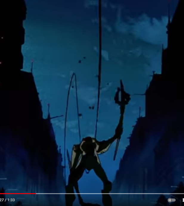
A freeze-frame of the moment where you can see both of Sachiel’s arms, seeming simultaneously flaccid and strong.
(Captured from a video that has since been taken down.)
In the beginning of the series, our hero pilots a giant flesh-machine called an Eva, to fight an equally giant monster called Sachiel. There's a moment in the fight where the Eva is on top of Sachiel, and Sachiel manages to throw the Eva off it. It's a very distinctive bit of choreography, for a few reasons: One, Sachiel is still standing, despite bearing the weight of the Eva on its chest. Two, Sachiel throws the massive Eva a substantial distance away without really adjusting its posture at all. And three, this all culminates in a brief shot where you see Sachiel, arched backwards, one arm hanging limply like a rope and the other aloft, having just thrown the Eva.
This shot subtly seems to suggest that Sachiel is following the same sort of “puppet-physics” I saw in Diaboromon. A more naturalistic way to show one humanoid throwing an equally-heavy humanoid off its chest would have the whole body executing the motion, heaving and propelling the mass with its whole torso. But instead, Sachiel appears almost entirely limp - as though there's an invisible puppeteer beyond the top of the screen that was the actual source of the force that sent the Eva flying.
And now I think we're getting to one of the core features that still captivates me about Diaboromon's design: the limbs (especially the arms) are constructed to lend itself not just to a creepily gaunt body, but to this eerie puppet-like movement.
Part three
Articulating a sub-trope
When I started writing this, I tried searching for more examples of this sort of phenomenon, using strings like “long arms monster” and “creepy long arms”, and almost none of what I found reminded me all that much of Diaboromon or Sachiel. There’s something more specific going on with these two.
Official concept art for OUR WAR GAME!
After digging through more childhood memories and thinking about it, I've come up with five “rules” to distinguish Diaboromon-style creepy-long-arms from so many of the other examples you'd find on the TV Tropes page for “Creepily Long Arms”:
Either lacks or hides a definitive elbow
Arms are disproportionately long compared to the torso and the legs
Should be more ropey/lanky than beefy/muscled
Arms are used mostly as arms, not as tentacles (so while they may move in a whip-like or serpentine way, they're not wrapping around someone like a snake)
Hands are disproportionately big compared to the head
I haven't yet found a concise name that seems to refer specifically to this collection of design elements, so it's possible either that I haven't looked hard enough or that this is too narrow to be a well-named trope unto itself.
I feel like there’s gotta be something here, because every now and then I see a monster design that hits this particular nail on the head - like this particular creature from the excellent sci-fi fantasy webcomic THE SWORD INTERVAL:
Panel from THE SWORD INTERVAL, art by Ben Fleuter
Outside of that, it’s slim pickings. Still, I found a few more examples that embody at least some of the above rules, and use them to similar effect.
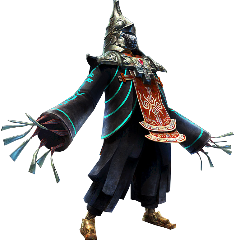
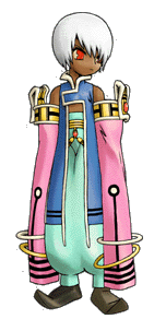
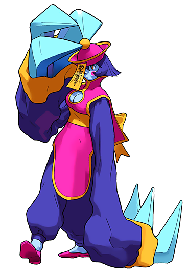
For humanoid/non-monster character design, this effect is sometimes achieved by using long sleeves that run past the fingertips of their wearer - such as you might see in the design of Zant (the antagonist of the 2006 video game THE LEGEND OF ZELDA: TWILIGHT PRINCESS) or Yurka (the antagonist of the 1999 video game EVOLUTION 2: FAR OFF PROMISE). Hsien-Ko from the Darkstalkers series of games is another example of this, except with actual hands at the end of the sleeves.
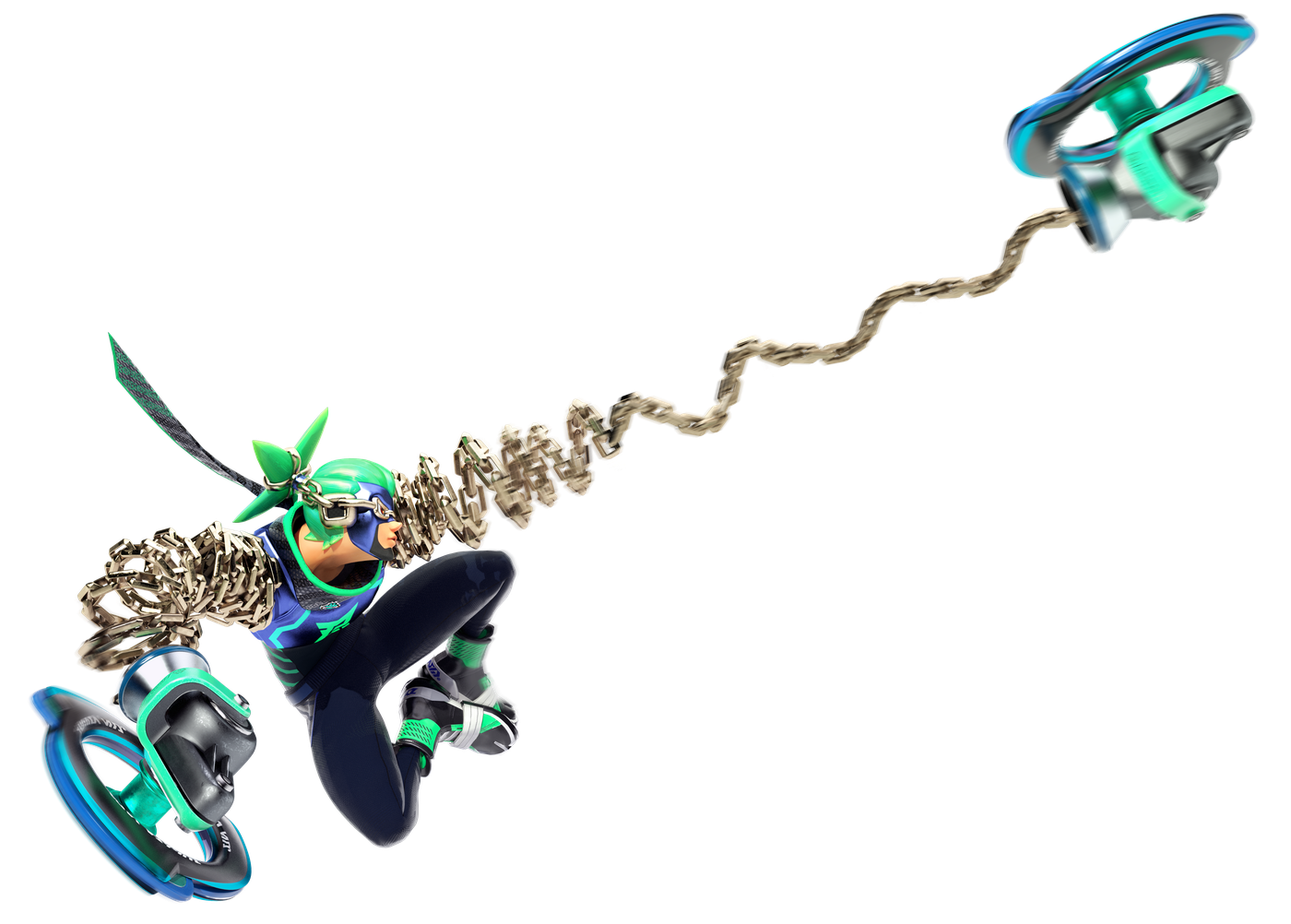
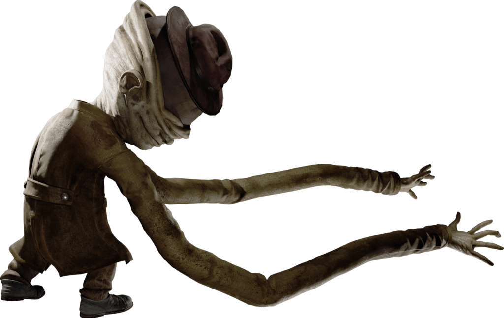
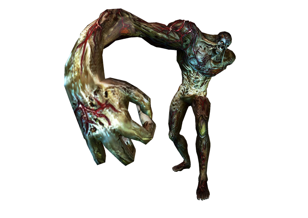
The entire 2017 fighting game ARMS is virtually built around this design, visible in almost any of their characters (such as Ninjara). Moving towards the monstrous side, the Janitor from the 2017 indie game LITTLE NIGHTMARES is close. The Bandersnatch from the Resident Evil games (particularly its depiction in 2009’s RESIDENT EVIL: THE DARKSIDE CHRONICLES) also follows a surprising amount of these rules, despite initially looking like a more traditional humanoid monster.
These are some of the few designs I’ve been able to find that come close to matching the vibes I’ve gotten from Diaboromon. Something in my gut tells me that this some sort of trend, that there’s way more examples out there that I just can’t find yet, but until I find them I can’t be sure that it isn’t just a childish fixation of mine.
Final Part
In defense of wacky waving inflatable arm flailing tube man
So what do long, pliable, elbow-less arms do for a character design?
I already mentioned that unusual puppet-like movement above. I think part of what makes this especially effective is that the body plan for monsters like Diaboromon tends to be outwardly humanoid - at least loosely - which exacerbates the “creepy” feel when it moves following a completely different set of rules from actual human anatomy. This is why puppets can be so unsettling: they look human, but move wrong.
Going further: Making the arms longer relative to the legs will lead to postures that are less human, as well - either by having the arms be so long that they naturally rest on the floor even when standing upright, or by getting combined with a slouched position to bring the monster's center of gravity forward.
Official concept art for OUR WAR GAME!
This unsteady posture leads intuitively to moving or balancing more with its forelimbs while still being nominally "upright", so you can have some freaky moving-on-all-fours movement while still being human-shaped. Diaboromon’s legs are even digitigrade (i.e. resting on its toes) like those of cats or dogs, further pushing his body forward into a quasi-quadrupedal stance.
But, weirdly enough, I think the most compelling use of these design elements is the one is the one that people are more likely to associate with Betty Boop than with Evangelion.
“Rubber hose animation” refers to a style of animating movement that was most popular in 1930s America. Cartoons made in this style were more evocative than naturalistic, full of curving and flailing motion - hence, “rubber hose”.
MINNIE THE MOOCHER (1932)
CUPHEAD (2017)
Rubber hose animation excels at caricature. Anatomy gets reduced down to just gestures, and the movement is pure emotion. If a character is relaxed, their arms flop to their sides like noodles. Hands literally ball into spherical fists.
Diaboromon isn’t quite this pliable, but I think he still has a fair bit of rubber hose sensibilities in his design. He has no choice but to be caricaturish in his movements - he lacks the basic anatomy to move naturalistically (at least, in a lot of his body).
Making the arms and hands disproportionately long has the effect of drawing more attention to their movements, which makes them seem exaggerated. A whip-like slap feels more violent; a limply hanging hand reaching towards you feels more menacing.
This exaggeration, then, gets contrasted with a mask-like face (as we saw in Diaboromon, Sachiel, and Zant) that is much less expressive than it should be - and you have a creature that emotes in somewhat human-like ways, but not the way actual humans do. It’s familiar, but unusual. It’s close, but off.
And if you're one of those people who gets enticed by the uncanny valley like I do, you just may find that juxtaposition fascinating and compelling.
This shot instantly cemented Diaboromon as one of my favorite monster designs the moment I saw it.
In writing this post, I spent a while trying to find good examples of monsters with these features using their arms expressively to illustrate this, and it was much harder than I expected. Often, the moments are exceedingly brief, and it’s hard to get a still image or short animation that really captures the gesture well. Diaboromon himself only really does it a couple of times in his already extremely limited screen time, and he’s my type specimen here.
In a funny way, my inability to find something that I'm confident must be out there just by virtue of not knowing what exactly it's called, is taking me back to my early-2000s days of trying to look up info about anime on Japanese fan sites.
Maybe I just haven’t found the right search terms, or seen enough varied media to be able to find these examples. Or maybe I've fallen in so deep that I can't tell the difference between official works and the fan art I've created in my mind over the years.


