12 Days of Monsters: Day 8
12 Days of Monsters is a series exploring the visual design of different monsters - looking at what makes them successful (or not), what trends they represent, and what they mean to me personally.
The Monster
Raw Shocks
from the 2009 video game SILENT HILL: SHATTERED MEMORIES
The Set-up
Masahiro Ito and the “Silent Hill look”
The story of SILENT HILL: SHATTERED MEMORIES is, in many ways, a story about coming home. This is true on several levels, including the look of the only monster in the game.
This monster - officially (but not in-game) named the "Raw Shock" - is very evocative of what could probably be identified as the "Silent Hill look" in monster design. But to tell the story of this design, we have to go back a bit.
The original RESIDENT EVIL was released in 1996, and is often considered to be the forefather of the "survival horror" genre in the 3D era. (CLOCK TOWER was another 3D horror game released in 1996, but was mechanically a different genre from RESIDENT EVIL - it was a point-and-click adventure, rather than an action-based game with combat elements, ammunition, etc.) The original SILENT HILL was released in 1999, and the similarities to RESIDENT EVIL were apparent to many - with some calling it a "shameless but slick RESIDENT EVIL clone", although there were some notable differences in tone, atmosphere, and themes. If the original SILENT HILL was seen as too similar to RESIDENT EVIL, though, 2001's sequel SILENT HILL 2 firmly differentiated the two - and one element of that is monster design.
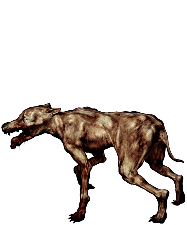
In RESIDENT EVIL, players are exploring a creepy zombie-infested mansion, and face a relatively varied biome of creatures - not just zombie people, but also zombie dogs, crows, snakes, insects, plants, even sharks.
Official art of three typical enemies from 1996’s RESIDENT EVIL
Similarly, the first SILENT HILL featured a diverse spread of creepy critters. While there were far fewer humanoid enemies, it still had dogs, a few different types of monstrous insects, some pterodactyl-like airborne enemies, and so forth. The bosses were also, like those in RESIDENT EVIL, large monstrous creatures.
Official art of a completely random selection of enemies from SILENT HILL
But SILENT HILL 2 is where the "Silent Hill look" became very clearly established, and there was no called it a "clone" of anything else then. This was largely the work of artist Masahiro Ito, who was a background and creature designer for the first game - but got promoted to art director for the second. The success of the first game basically translated into a "mandate" for many of the creative leads in Team Silent, and you could see them fully capitalize on it with tightly focused and clearly motivated design direction in the second. For Ito, this resulted in a look for the monsters that became a huge part of the Silent Hill brand from there on.
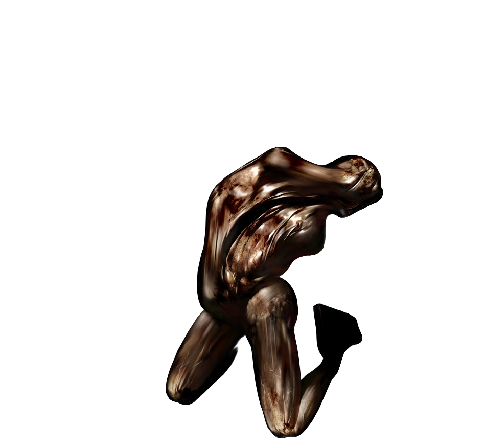
For starters, the "biome" of monsters in SILENT HILL 2 shrank considerably - gone were the random dogs and bird-like things and (most of the) bugs that felt obligatory on the creature roster after RESIDENT EVIL. In SILENT HILL 2, all but one of the enemies are humanoid (the only exception is cockroaches which appear for a brief portion). While many of them are contorted or deformed into very un-human-like figures, they are still about the size of a human and still made of human parts. Additionally, Ito's monsters featured almost nothing in the way of overtly threatening or dangerous elements - they had no teeth or claws, and only two of them even had any weapon at all. They didn't have creepy faces (most of them didn't have faces at all), and they weren't so much "covered in blood" as they were "colored in a way that suggested blood, or maybe rust, or maybe some other combination of human and/or architectural excreta". Prominently, the monsters all had a smooth, discolored skin-like patina covering them - like they were wrapped in a vacuum-sealed trash bag made of human integument.
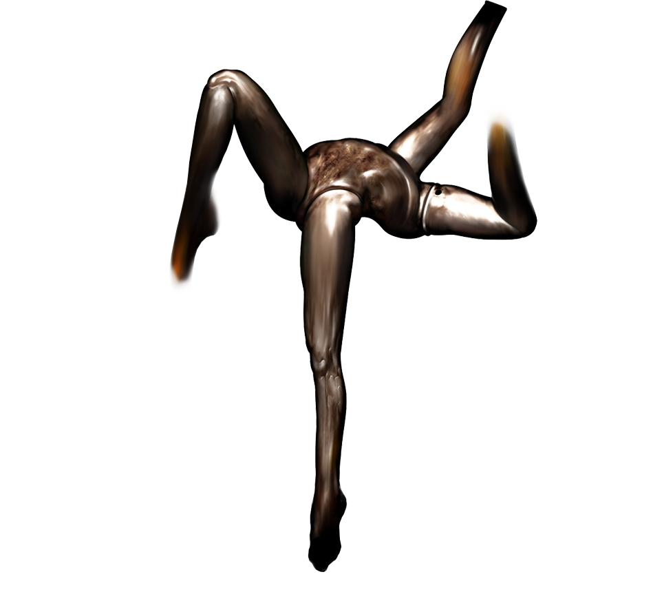
Official art of three enemies from SILENT HILL 2
This is the "Silent Hill look".
These design decisions were, of course, informed by the story of SILENT HILL 2. In the game, these various creatures are all (except maybe the cockroaches) meant to be manifestations of a tortured mind - they are embodiments of guilt, anguish, lust, resentment, repression, and trauma - manifest to both torment the people stuck in the town and to lead them to their personal truths. This was, to some degree, technically true in the first game, too. Those creatures were created by a tortured child with supernatural powers, sharing her subconscious feelings, fears, and memories with the town. But even though there is technically a metaphorical meaning to each monster in the first game, it can be easy to miss. After RESIDENT EVIL, players wouldn't necessarily wonder what the creepy dogs in SILENT HILL were supposed to evoke. But in SILENT HILL 2, the novelty of these designs and the consistency of their motifs and elements made these messages virtually inescapable. Even if you didn't find yourself consciously thinking "oh, this is about repressed sexuality" the first time you saw a monster that appears to be two sets of feminine mannequin legs joined at the waist, you certainly got the gist on some level - especially once you saw how the monsters interacted with each other.
SILENT HILL 2 was a huge success, critically and commercially, and essentially defined the series - and the survival horror genre as a whole - for years.
History Lesson
The Wheels Come Off
So, what was the road between SILENT HILL 2 and SILENT HILL: SHATTERED MEMORIES like? Let’s sprint through the entries in between these games.
SILENT HILL 3 (2003) was a direct sequel to the first game (SILENT HILL 2 had been a standalone story that happened to be set in the same place), and brought the ascendant popularity of the "Silent Hill look" to the wider monster roster of the first game. Masahiro Ito is again firing on all cylinders here, but the target isn't nearly as narrow as it was with the second game. The success of SILENT HILL 2 meant that the marching orders had changed from “make a RESIDENT EVIL clone” to “make more SILENT HILL games”.
SILENT HILL 4 (2004) was another standalone game. This was a divisive entry in the series that has since developed a minor cult following. I adore this game, and can go on forever about it - for now, let’s just note that Ito didn't work on this game, and after it, "Team Silent" disbanded entirely.
SILENT HILL: ORIGINS (2007) is real bad. You know those fanfictions written by authors that create new characters just to go hang out with their faves, and then happen to go through plots that beat-for-beat recreate all the stuff they love about their faves? That's what this game is. It tried real hard to look like SILENT HILL 2, and to feature all the stuff it thought people liked from SILENT HILL and SILENT HILL 3, and it was all-around uncreative and poorly done.
SILENT HILL: HOMECOMING (2009) was made by an entirely different creative team, and is very clearly a game that was not only made in the shadow of previous entries in the series, but also made in the shadow of RESIDENT EVIL 4 (which had come out in 2005, making infinite money and winning infinite awards). With a new creative vision, the marching orders reverting back to “copy the successful Resident Evil game”, the game had, by my count, just one interesting new monster design - the rest were mostly either carbon copies of popular Silent Hill monsters (like the nurses from SILENT HILL 2, or Pyramid Head as he appeared in the 2006 film adaptation of the first game, also just called SILENT HILL), or monsters that didn't fit the "Silent Hill look" whatsoever. Now, by 2009, there were indeed some fans who were happy to get out of Masahiro Ito's shadow - but HOMECOMING didn't represent a new direction for the series: it represented an unmotivated mash-up of old faves and incongruous new nonsense.
And that, finally, brings us to SILENT HILL: SHATTERED MEMORIES - which also came out in 2009, but was made by an entirely different team than HOMECOMING, and was released for the Nintendo Wii - at the time, a platform which seemed to be heavily targeting children and party games, not horror. However, where HOMECOMING wanted to be fresh a new entry in a (decreasingly) beloved series and failed, SHATTERED MEMORIES somehow succeeded.
Some Silent Hill fans like to repeat a “the Japanese stuff is the best; the Western stuff is trash” narrative here (Team Silent was Japanese, and all the games made after they disbanded were made by studios in the US or Europe) - but this title basically punches a hole in that assessment.
SHATTERED MEMORIES is essentially a complete reboot of the very first Silent Hill game (bringing in some minor elements from the third game), with some pretty clever twists and additions, and an overall aesthetic that is both new to the series and evocative of its roots.
Like the shift in design approach from SILENT HILL to SILENT HILL 2, the shift from ORIGINS and HOMECOMING to SHATTERED MEMORIES represented an extreme narrowing of focus - a commitment to execute on a specific vision, rather than replicating a previous model.
But SHATTERED MEMORIES took that narrowing of focus further than SILENT HILL 2 did. There is literally just one type of enemy in SHATTERED MEMORIES.
Well.
Kind of.
Let's talk about it.
The Game
Blind children clutching photos
SHATTERED MEMORIES has three major gameplay modes:
A first-person framing narrative set in the present, where you are in a psychoanalyst's office answering questions and talking about yourself
An "exploration" mode where you wander around a town during a freak snowstorm, collecting clues and solving puzzles
A "nightmare" mode where unnatural cliffs of ice fracture and seal off parts of the town, turning the world harsh and jagged, and you need to run to make it to the safe zone at the end
The game generally cycles through these modes, in this order. The first-person mode sets up some themes, which then come up during the “exploration” mode - until you hit a major discovery, at which point “exploration” turns to “nightmare”. Once you escape, you go back to the first-person mode, and set up themes for the next chapter of the story.
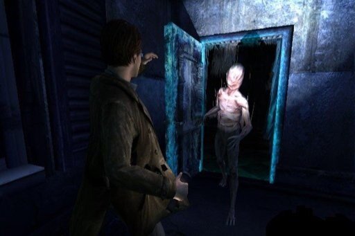
It is during the nightmare sequences that you are attacked by the only enemy type in the game - the Raw Shocks. (The name, by the way, is apparently a pun on "Rorschach" - a famous type of ink blot test used in psychological analysis.) These are child-sized humanoid enemies whose main goal is simply to grab you, forcing you to throw them off in order to keep running. As more of them grab you, your body temperature lowers, and if you get caught by enough of them, you succumb to the freezing cold as they creepily caress you. There's no weapons, no ammunition, no combat - you just need to escape. From these strange things that seem to love you. Lethally.
A Raw Shock advances on the player during nightmare mode
On the surface, the Raw Shocks pretty much look like stock knock-offs of Masahiro Ito's designs from SILENT HILL 2: They are smooth, featureless humanoids, wrapped in a mottled/smeared skin casing.
The deal with the Raw Shocks, though, is that their appearance starts to change as you continue to play the game. That's cool on its own, but I can't tell you how much cooler it was when I had a friend spend the night at my apartment, woke up to him playing a new file on my copy of SHATTERED MEMORIES, and saw that his Raw Shocks looked completely different.
SHATTERED MEMORIES is a great game, y'all. I wish it were easier to find and play a copy of it these days, because it's really something special. But, knowing that it's real hard to do so, I'm going to go under the hood and explain all that stuff that I wish you could experience on your own for the first time through playing the game yourselves.
The Visual Design
You see it too?
You see, the game's central gimmick is that it performs a "psychological assessment" on you as you play the game - and that aspects of the game change based on this assessment. This gimmick is signaled pretty loudly when you boot it up, with a hokey "warning" appearing on the screen telling you that "This game plays you as much as you play it." This gimmick is clearest in the framing narrative scenes where you are in a psychoanalyst's office. You answer questionnaires, you do activities like coloring in drawings or sorting pictures, etc. - it's a little obvious, but it works well enough. What really makes the game stand out, though, is all of the more subtle and invisible ways it "assesses" you, and how they get reflected back at you in gameplay.
For example: At one point, the psychoanalyst has you color in a drawing of a house. Then, back in the "exploration" segment, you come across a house whose colors match the way you colored it in with the psychoanalyst. That's cool, but what's really cool is that HOW you colored it affects how your character behaves in the cutscene where they reach the house. If you rushed while coloring the house, your character is more impatient and clipped during the following cutscene. The game doesn't tell you this - there's no Bethesda-style "Kaufmann didn't like that" notification appearing in the top of your screen - I literally never knew it until looking this game up recently in preparation for writing this.
Silent Hill games have always had multiple endings. The most subtle way to determine which ending you got was back in SILENT HILL 2, whether the amount of real-world time you spent examining a specific item in your inventory that had no in-game use influenced whether or not you would get an ending that was thematically tied to that item. That is, until SHATTERED MEMORIES, whose entire ethos amounts to taking that concept and making it the game's central mechanic - while still keeping it just as invisible to the player. SHATTERED MEMORIES will track things like which sorts of advertisements you pay the most attention to when exploring abandoned storefronts or malls (are they about beer? video games? something else?), which other props you try to interact with (do you keep fixating on ashtrays, as if longing for a smoke?), whether you aim the camera at a female character's breasts during a cutscene, and what a player's stated beliefs about marriage is.
Official art of the Raw Shocks as you first encounter them in the game (probably)
All these things (and more) are tracked, and ultimately shape the appearance of the Raw Shocks as the game progresses. There are four different "archetypes" for the Raw Shocks, and there is a sliding gradient - they don't instantly go from "default" to "maxed out" in one of the four forms. The Raw Shocks can also represent blends of different configurations, too - the game's multiple endings may be mutually exclusive, but the during-gameplay customizations at least reflect the possibility of blending options. (The appearance of the Raw Shocks doesn't strictly indicate which ending you will get, either.)
In my save file, back at my old apartment, the Raw Shocks had started to become abstract and geometric in appearance. Parts of them were missing, or otherwise shifted to the side, creating strange patches of empty space in their anatomy, segmented by straight lines and right angles. This was a fascinating concept on its own to me, but I was amazed when I woke up to see my friend playing his file, and seeing his Raw Shocks have hips, breasts, lips, and more overtly feminine and sexualized features (which was additionally unnerving, as they were still child-sized). But as I kept watching my friend play, I was floored by what I saw next.
The Raw Shocks that chased me: geometric, hollow, broken
My friend’s Raw Shocks: curvy, femme
He walked into a room that I had already been to. It was a large cabin in a campgrounds, with a big lounge-like area adorned with maybe 1 or two mounted elk heads, a single taxidermized bear standing menacingly in the corner, and some other generically creepy miscellany strewn about (a chandelier, a grandfather clock, that sort of thing). But that's not what it looked like when my friend entered the room. His version had meathooks dangling from the ceiling, butcher's tarps instead of rugs or carpets, all the furniture pushed up against the walls, blood splattered everywhere - and instead of a taxidermized bear, there was a freshly dead bear corpse lying down on the dining table in the middle of the room, chest and abdominal cavity cut open, guts and lungs out. It took him a few moments of exploring the room before he noticed me staring, agape, at the screen - and when he asked what was up, it took me a moment before I could simply say "...That's not what that room looked like for me."
Now, obviously this game isn't performing any sort of legitimate "psychological assessment" of you. But when you don't know offhand where the decision points are, when you can't easily guess what sorts of different input your friends might have made compared to you, when any few minutes of gameplay don't look very loudly different from one playthrough to another...and then you see the game give your friend a room that looks like that, where yours was totally different...well...it's kinda hard not to look at your friend to at least a moment, and wonder, "What conclusions is this game drawing about you? And why?"
That's a really compelling moment. Especially for a late-2000s Wii title that's a reboot of a franchise way past its prime.
It turns out that the appearance of the Raw Shocks is just the tip of the iceberg. Like the appearance of the house you find after coloring in a drawing of a house during the psychoanalyst's session, the Raw Shocks are simply the most visible reflection of your inputs. The game also adjusts the appearance of certain rooms and areas, sometimes drastically. Cutscenes change, too - including both the appearance and personality of major characters in them. Even notes, memos, and recordings can change - does the voicemail you find sound calm, or terrified? Is the person on the other end of the line angry? Scared? Drunk?
I have no way to replay this game currently, but even so, I don't want to look up too much more of how it all works and what all can change, because this sort of uncertainty via the opacity of the game's mechanics is really compelling.
There were some complaints that the gameplay of SHATTERED MEMORIES was too simple or repetitive, and the lack of enemy variety factored in from time to time - but realistically, I think this is more a strength of the game than anything else. The game is not about combat, and is only at most one-half about avoiding enemies. The game has a story to tell, and it wants you to participate in telling it. The Raw Shocks are almost more like an interactive audience to the tale you are jointly weaving - their faces reflecting the tone and subtext of your inputs, even when you're not aware you're putting it in there.
It is an exceptionally purposeful and focused game, and like SILENT HILL 2 before it, it shows what sort of memorable things you can create from relatively simple parts through a series of consistent, motivated choices.
The Raw Shocks were not designed by Masahiro Ito. But not only do they evoke his seminal art with their design aesthetics, they also evoke Team Silent’s underlying monster design ethos through the game mechanics that adjust their shape, and thus their meaning, based on player actions.
SILENT HILL 2 established the idea that the town of Silent Hill, and all the shadows in it, reflects in inner turmoil of the people who find themselves trapped in it. People who meet each other in the town might be occupying the same physical space, but they are in different realities - each in their own private hell. Despite this, however, Silent Hill is a brand - and as such, the games have generally tried to resemble the most successful iterations of that brand…leading to a lot of “custom hellscapes” that look pretty similar. But there was a brief moment in SILENT HILL 2 where you actually managed to break through into someone else’s world: After destroying a monster representing some of the abuses this person suffered, suddenly your environment changes. The wet, dilapidated hotel you used to be standing in is now suddenly entirely engulfed in flames. “It’s hot as Hell in here,” your character remarks - and the other person answers: “You see it too? For me, it’s always like this.” Then they retreat deeper into their hell, and you go back to yours.
SHATTERED MEMORIES is a Silent Hill game that, finally, shows you a different hell. While maintaining enough threads to tie back to its predecessors (or, maybe more accurately, its inspiration) it dedicates itself to the idea that each of us can be in our own reality. One shaped by countless invisible choices over time. One that other people, even people we are incredibly close to, might not ever be able to see except for the briefest of glimpses.
And in its own way, extremely limited and superficial though it may ultimately be as a relatively , this game steps up to the plate and offers an attempt to make good on SILENT HILL 2’s promise of seeing into someone else’s reality - and seeing what their monsters look like.


